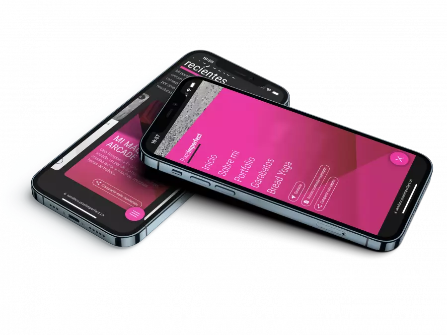
Portfolio Social services
Die Innere Stimme.
Project information
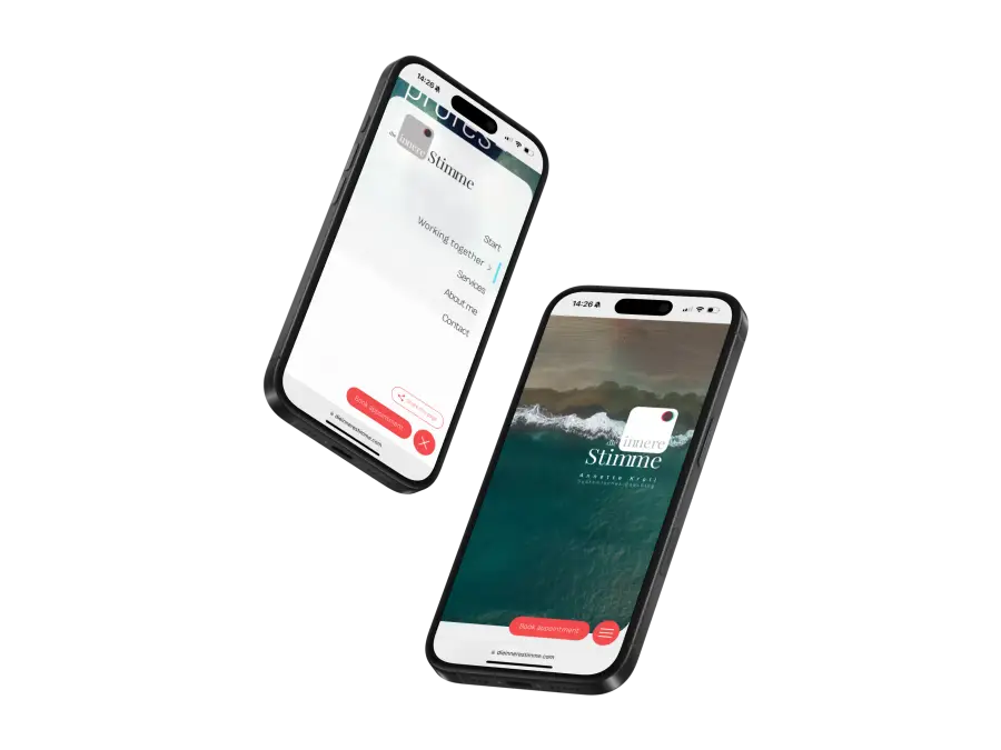
Project: Die Innere Stimme
Client: Annette Kroll, Systemic Coaching
Industry: Social services
Company: -
Location: Munich
Date: September 2024
In all projects, whether large or small, new challenges always arise. There is always something new to learn. In the case of Die Innere Stimme, the website of Annette Kroll (systemic coach specializing in the cultural sector), I found a very good solution to a recurring problem by applying a completely different approach.
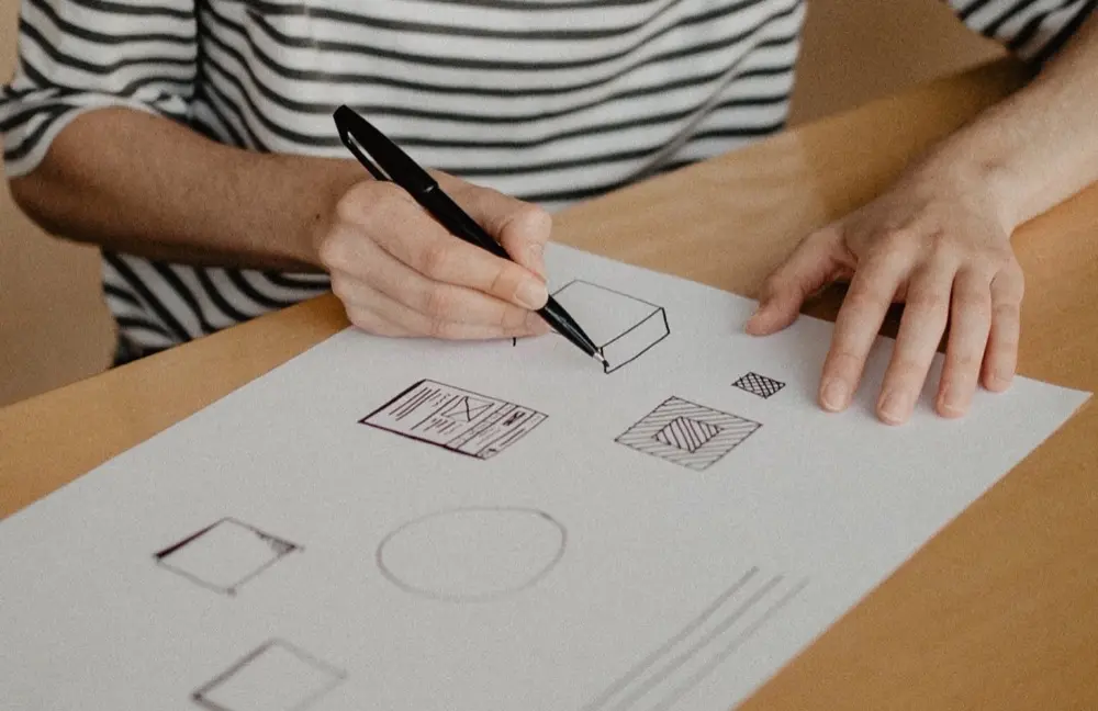
In my 25 years of experience in graphic design, I have always sought (like all designers) a good solution to integrate text onto an image to create sufficient contrast to ensure good readability. When working in editorial design, each case is independent and all content must be reviewed before publication. But when working on a digital project with dynamic content where editors can change texts and images, the situation can be more complex.
When I started working on the graphic proposals for the Die Innere Stimme website, I wanted the result to enhance the corporate image I had previously developed. Clear, transparent, and without loud colors. The brand should be part of the content, integrated but not diluted in it. For this reason, I intended from the beginning that the Die Innere Stimme logo and the navigation menu would not be separated from the content by a colored background or shading. Similarly, I also wanted the section and banner headlines to be directly on the images without interposing graphic elements to enhance the contrast.
For this, I initially tested using CSS filters that would invert the text color based on the background. The idea was good, but I quickly realized that this system would only work with high-contrast images: when the texts were on mid-tones (regardless of the color), the result was a gray tone that completely hindered the readability of the content. Conclusion: on mid-tones, black or white text worked better.
It was clear that if I wanted to give the project editors complete freedom, I had to find a better solution. A solution to a problem I had experienced throughout my entire professional career.
Die Innere Stimme is a project whose administration is developed with Fire Monkey. This gave me two great advantages: I have complete freedom to create new functionalities in the CMS, and it is also possible to easily collect data on the front-end. From that point, I had an idea: if the logo and menu should always be displayed in their positive or negative versions depending on whether they are on a light or dark background, why not automate this parameter?
Let there be light or, better said, let's define luminance.
Calculating the luminance of the images: that was the solution. Determining whether the images were light or dark. For this, I developed a function in PHP that calculates the luminance of the images. Whenever an editor adds an image to the header of a section or a banner, the CMS identifies the luminance of that image. This means that PHP analyzes the image pixel by pixel and assigns it a value between 0 and 255, where 0 would be a completely black image and 255 a completely white image. Thus, the CMS adds a value to these images that is later picked up by the front-end, so we can know if the image in question is light or dark. It's that simple.
But why is this image analysis carried out by the back-end with PHP and not by the front-end with JavaScript? Efficiency: PHP performs this analysis only once and records it on the server, whereas JavaScript would perform this calculation every time a page is loaded, causing considerable resource consumption.
The rest of the task is executed on the front-end with JavaScript: every time we scroll, JavaScript compares whether there is a header or banner image under the menu and reads a parameter corresponding to its luminance. Based on this value, we determine whether the texts will be white or black. In the case of the texts in the headers and banners, to optimize resources, the text color (white or black) is defined directly on the server with PHP.

It was extremely satisfying to see how a recurring problem that had caused so many headaches in projects using CMS like Drupal or Typo3 could be solved so easily with Fire Monkey thanks to its extreme flexibility.
You can see the result on Annette Kroll's website: www.dieinnerestimme.com